Disney International Marketing
My Role: Principal UX and Product Architect
Disney's International Marketing Group had an enterprise-scale problem: the process they relied on to launch and market theatrical campaigns internationally was outdated, fragmented, and no longer fit for purpose.
Following an initial consultation to surface pain points, define the core issues to address, and scope primary user types and use-case scenarios, I identified their core need: not a configured off-the-shelf tool, but a fully customized platform portal, purpose-built around how their international teams actually work. The concept drew on familiar SharePoint paradigms but was architected entirely for Disney's environment and workflows.
Stakeholder buy-in was immediate. I won the UX contract and was flown to Los Angeles the following day to lead a three-day intensive onsite with the agency and Disney teams, serving as Principal UX and Product Architect.
My engagement followed a clear arc: immersive in-person discovery interviews, then a focused two-week remote sprint to synthesize findings, develop the platform usability architecture, and build out the early-stage design system.
At the final presentation, the reception was unambiguous. A room of senior stakeholders who had been carrying the weight of a high-visibility, high-pressure initiative left that presentation visibly relieved and energized.
In enterprise UX consulting, that moment is the metric. It means the work resolved something real, communicated clearly to people with a lot riding on it, and gave a large organization a credible path forward on a compressed timeline.
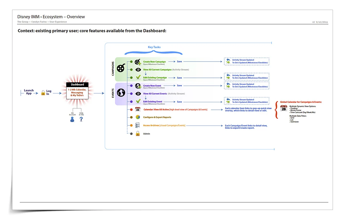
One of my core discovery methods is the ecosystem diagram: a comprehensive map of every entry point, destination screen, core task, and data flow within a system, including ingestion and export touchpoints. It gives stakeholders and collaborators a shared structural view of how the product actually works. When the engagement involves an existing system, I typically produce two versions, current and proposed, to anchor redesign discussions in a clear, visual side-by-side.
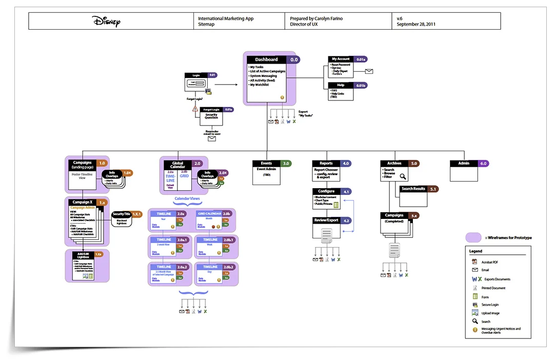
This sitemap defines the full scope of the front-end experience: entry points and user decision paths, collaboration and communication tools, proposed features and functionality, content import and export touchpoints, and the underlying technologies powering the system. Together, these layers give stakeholders a single, authoritative view of the product, how it behaves, and where it connects.
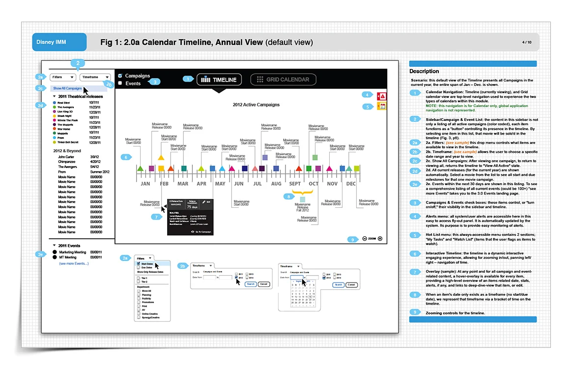
It was a known factor this system would have a complex user experience under the hood, but my highest imperative was that it be absolutely intuitive to use.
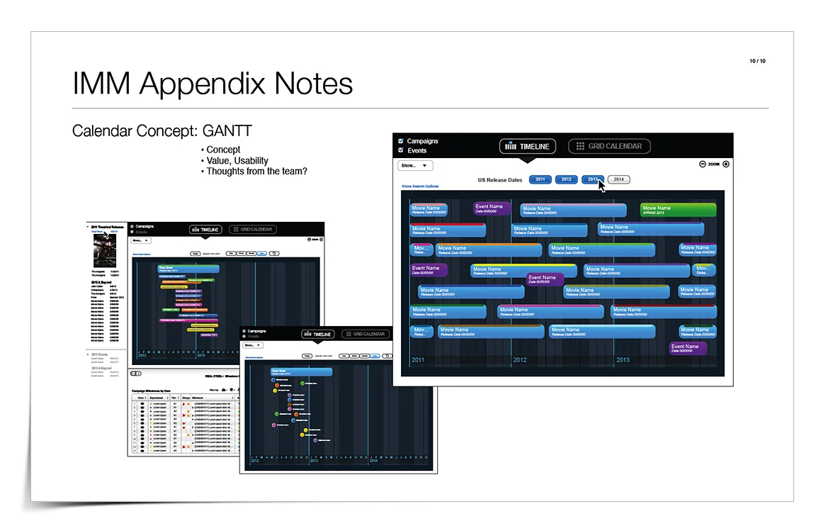
This wireframe of the 'Annual-view of campaigns timeline' features color coding of each campaign for quick identification, with shapes representing starting/ending states. Once the user learns this simple key, browsing/searching/finding throughout the system becomes effortless.
Campaigns features two views: timeline and calendar grid, with filtering/soloing by campaigns and/or film-related events.
The wireframe also illustrates various interaction mechanisms by which additional controls, content and options are accessed.
There are two tools which consistently follow the user throughout the system: Alerts Menu and Hot List (which contains My Tasks and Watch List). This is just one example of how I was able to interpret the user's needs into an intuitive and problem-solving system.
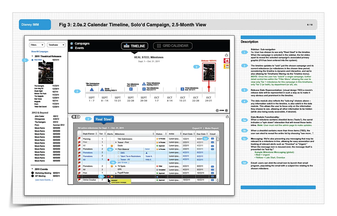
In this wire, I'm illustrating a 2.5 month view of a selected campaign, showing all key milestones in the timeline. Users can zoom in/out of the graphical timeline for more granular or high-level data representation.
The spreadsheet-like panel below allows for much detailed information to be presented in a compact yet easy to understand way, while also indicating context, hierarchy and offering additional controls. Users view, sort, select, email, and receive alerts within this panel. Users can also navigate other active, past and future campaigns via the ever-present Campaigns panel on the left.
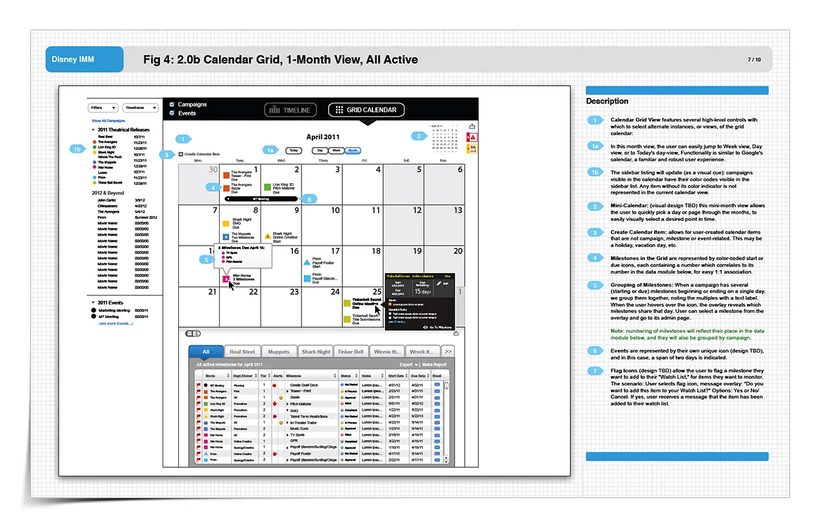
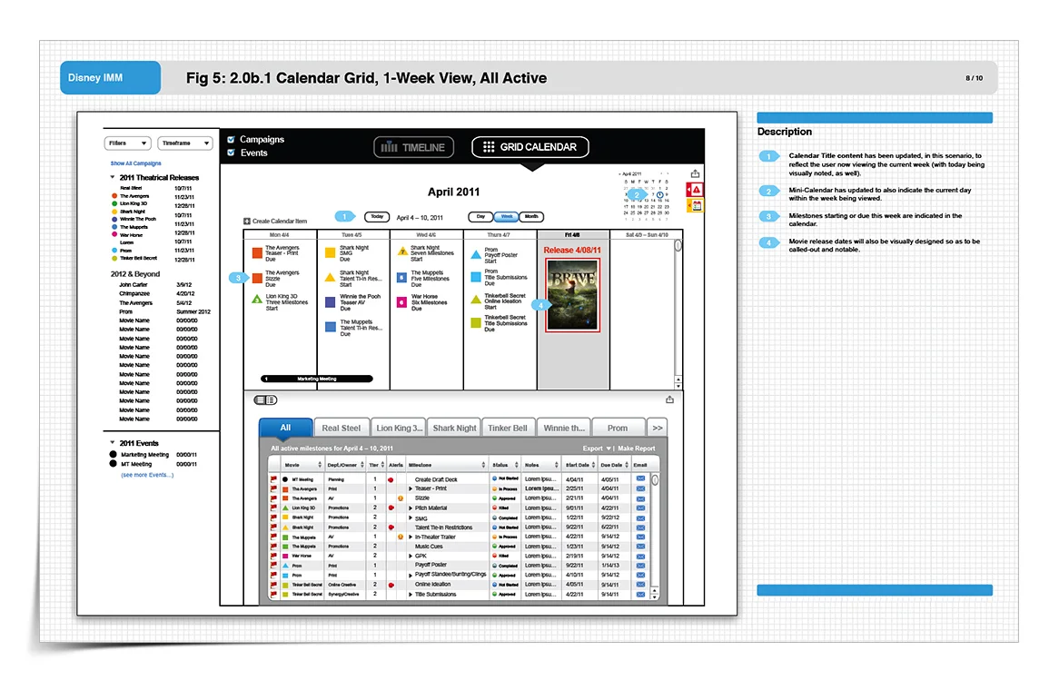
This calendar view surfaces both campaigns and events in a single, unified interface, with distinct interaction mechanisms for each. Users can create new calendar items directly from this state, and drill into individual campaigns or the full campaign set through a persistent data panel below, keeping all critical information within reach while preserving the ability to navigate deeper levels of data and controls through self-directed exploration.
The reception from both Disney stakeholders and the agency development team reflected what I aim for with every engagement: acknowledgment that the thinking was thorough and the execution was high-level craft.
That standard is intentional. I treat wireframes as blueprints, precise, functional maps for building software. Every discipline on the receiving end of the deliverable, (client-stakeholder, PM, design, development, content, product, QA), should be able to find exactly what they need to execute their part of the work.