SocialCare
HEALTH SYMMETRIC has created SocialCare, the first-ever Meaningful Use (Government Certified) Electronic Health Platform with social networking features which connect doctors, patients, care teams, pharmas, ancillary healthcare providers, and even extended care teams such as fitness and diet care teams. It also harnesses the power of Data Science, Big Data, and distributed clouds to extract meaningful knowledge and wisdom from the health platforms to allow change, improvements, and transformation to occur at all levels from private practices, large health organizations, insurance, pharma, providers to healthcare and the government. It is also a transformational product as the world moves to the post PC era where mobility and devices will be important as the US health system reinvents itself.
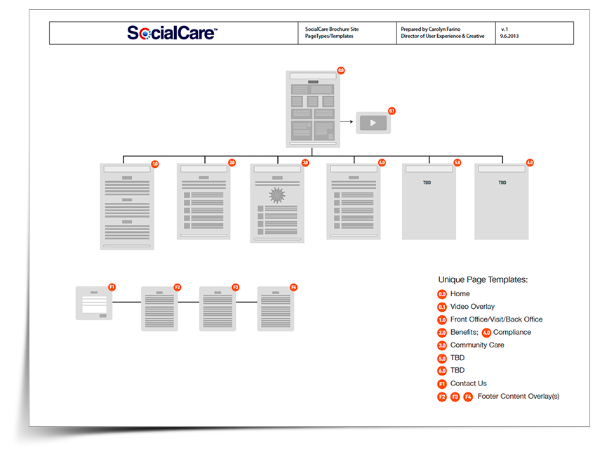
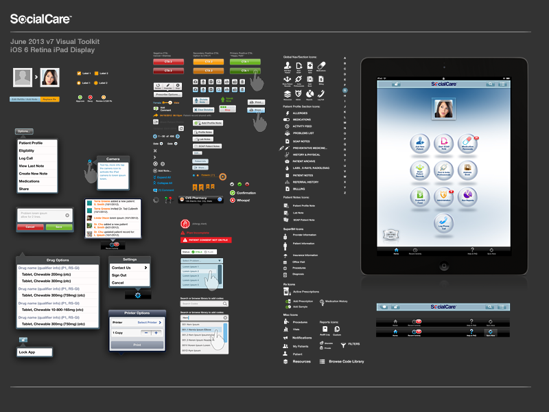
Responsible for leading product design, UX and creative for secure, multi-cloud EHR platforms for iOS/tablet and web. Responsible for driving product features & functionality definition with SME validation, creating enterprise-scale user experience, responsive user interface design and final asset production while meeting and maintaining HIPAA-compliance. Designed startup's brand & guidelines; established iOS UI creative-dev integration processes, created detailed design language and visual toolkits.
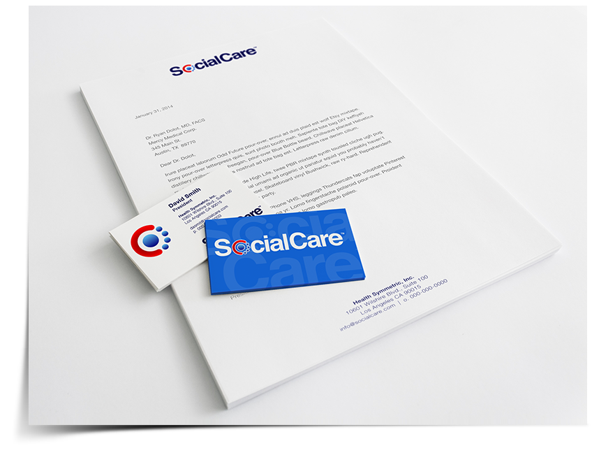
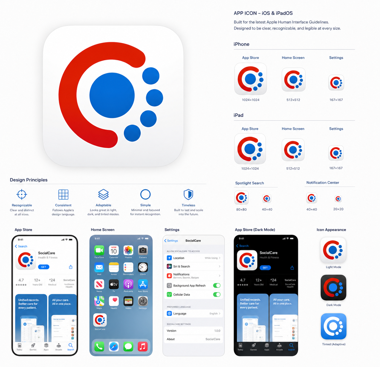
Branding for both the startup and it's flagship product, I created a treatment based on the client's requirements: must be red/white/blue color scheme and not contain any medical/healthcare iconography.
This final mark can be seen as an abstract top-down view of a care-giver and his patients, or reversed – a patient and his care team. It can also represent the SocialCare core platform and the future product family.
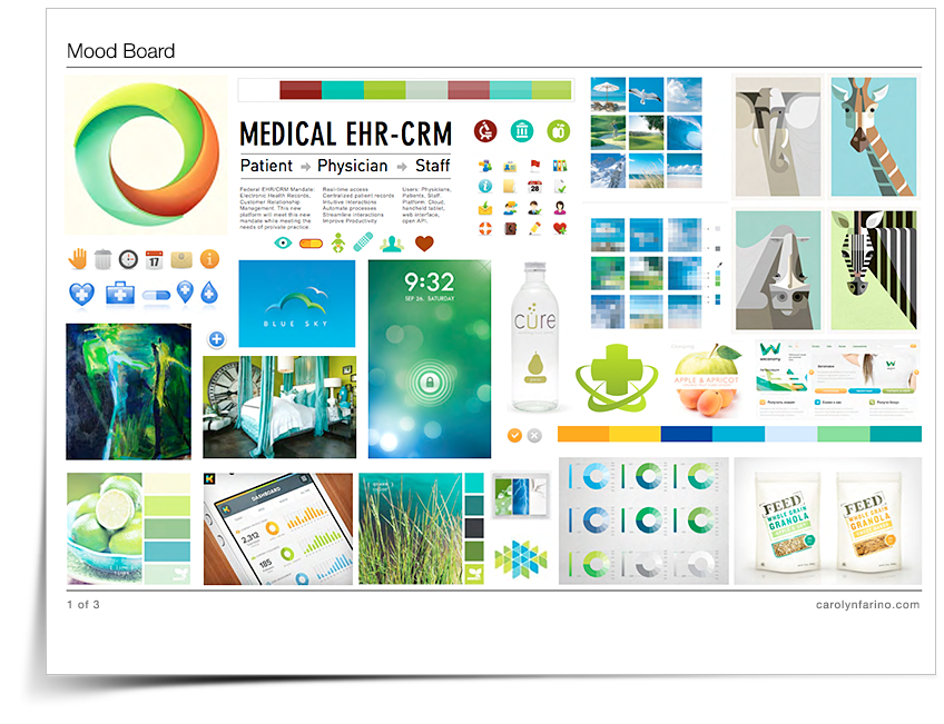
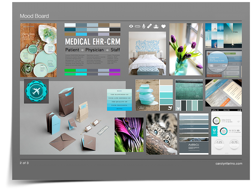
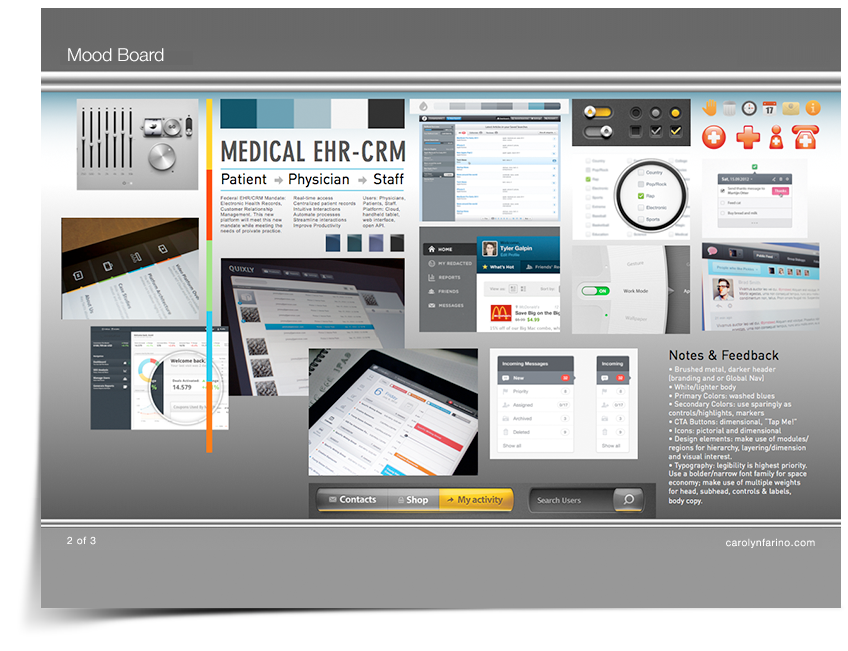
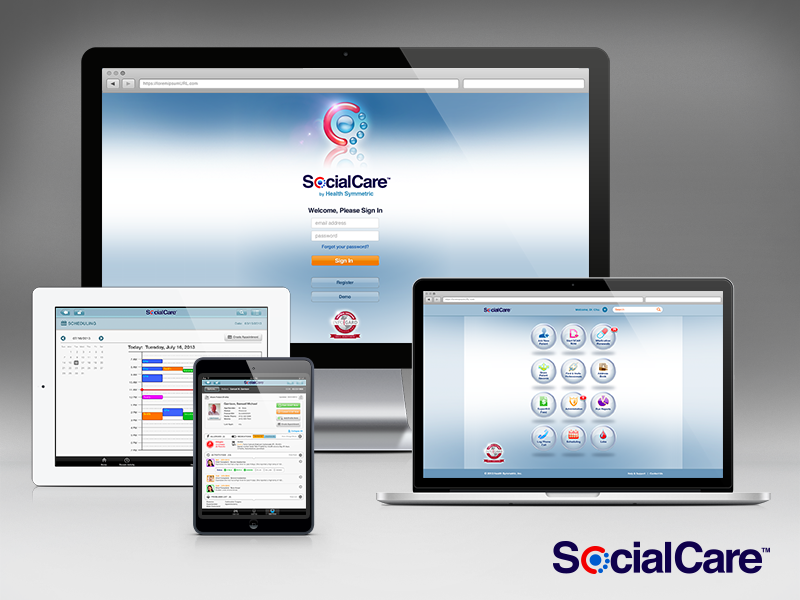
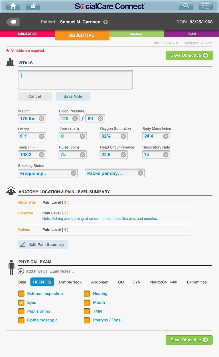
SocialCare's primary use cases are targeted at two main platforms: iOS tablets in use during 1:1 patient care during exams and visits. Secondary use case is browser-based, used by the office staff, back-of-house and admins.
I created the branding, GUI design and UX architecture for the startup and the product.
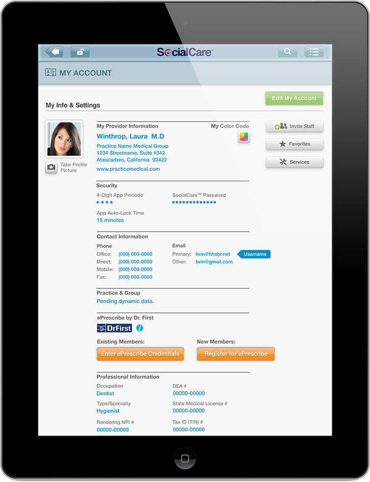
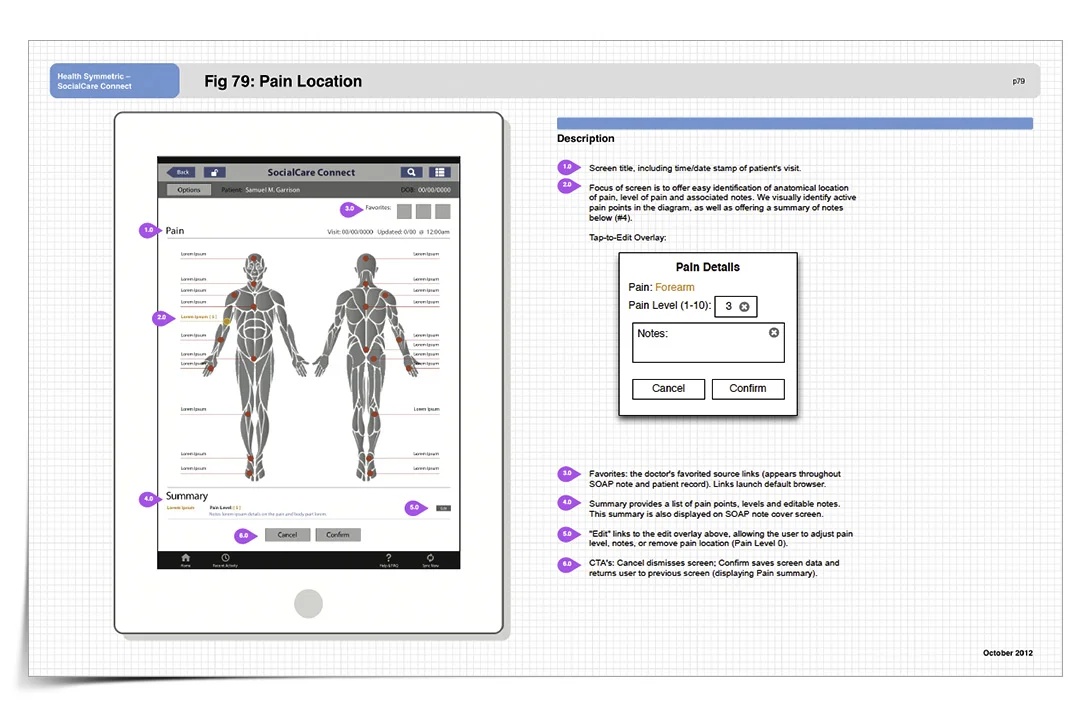
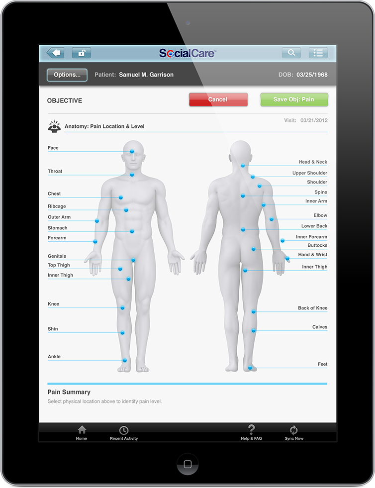
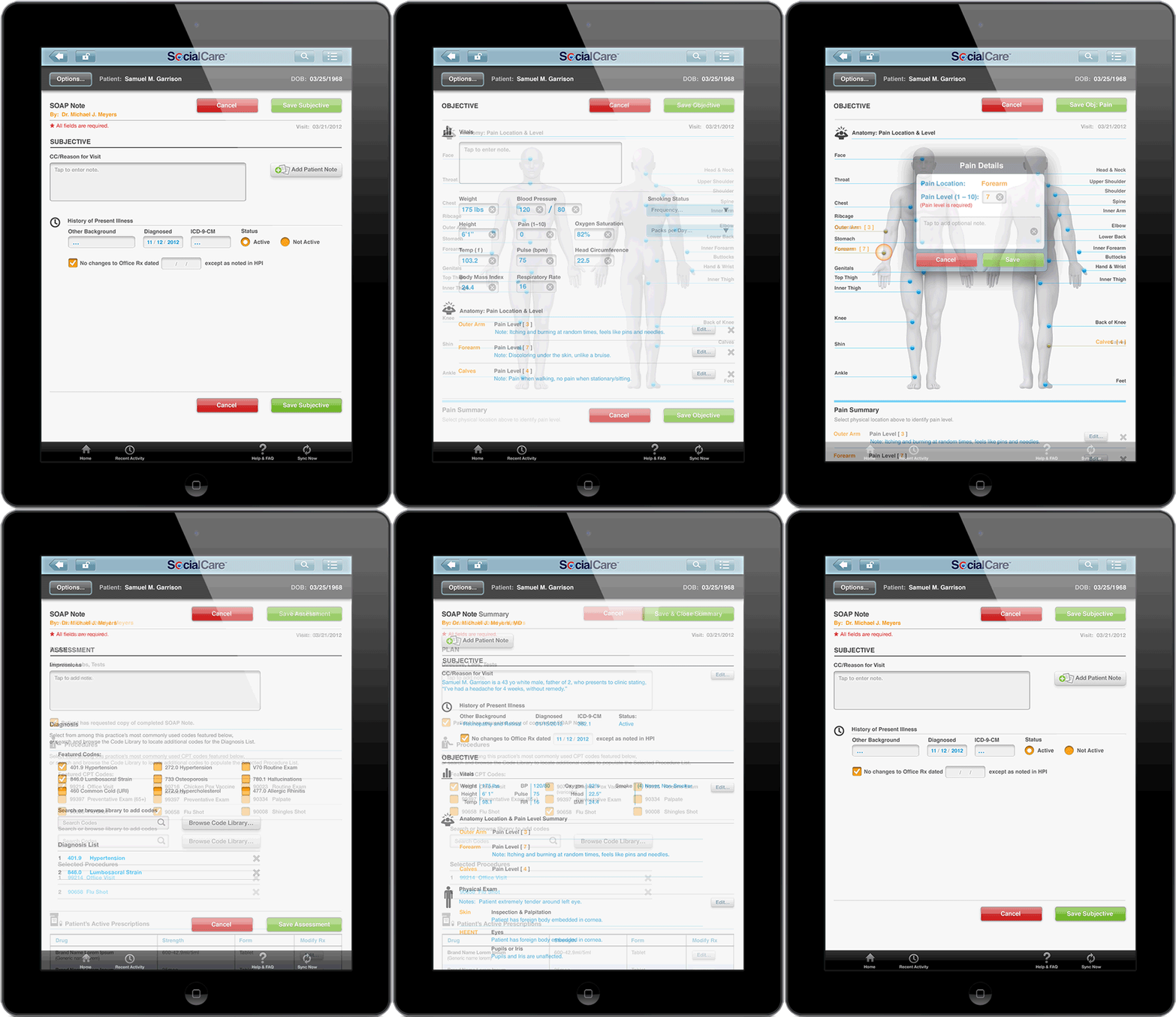
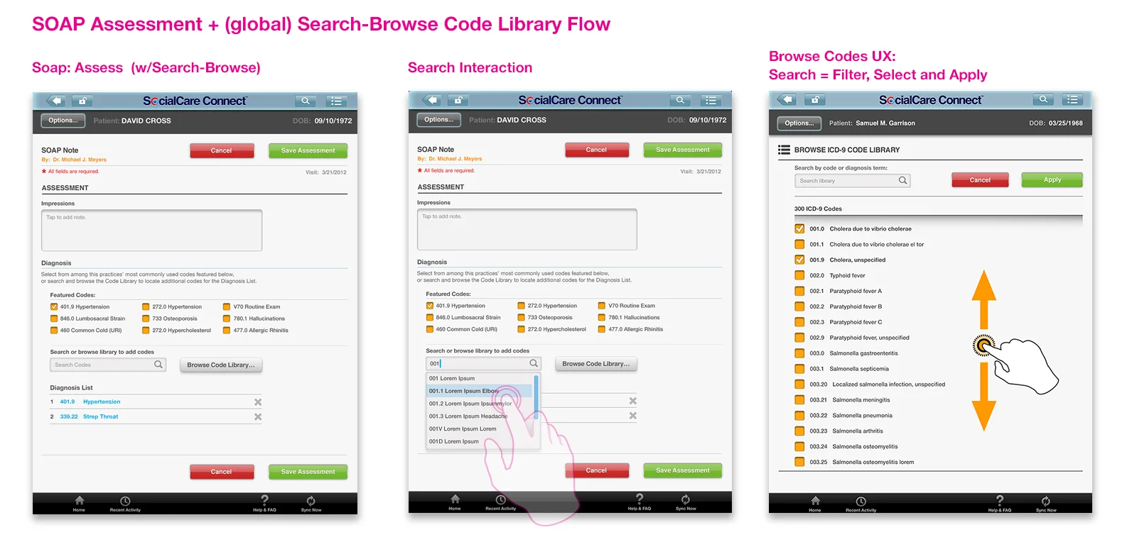
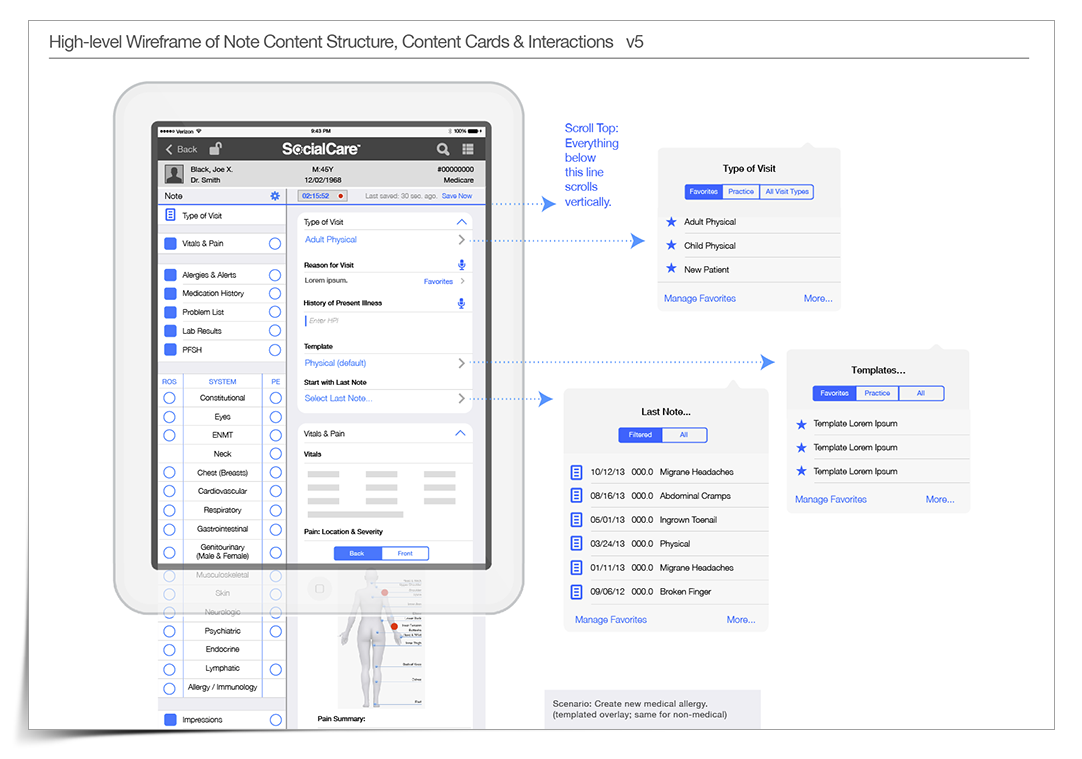
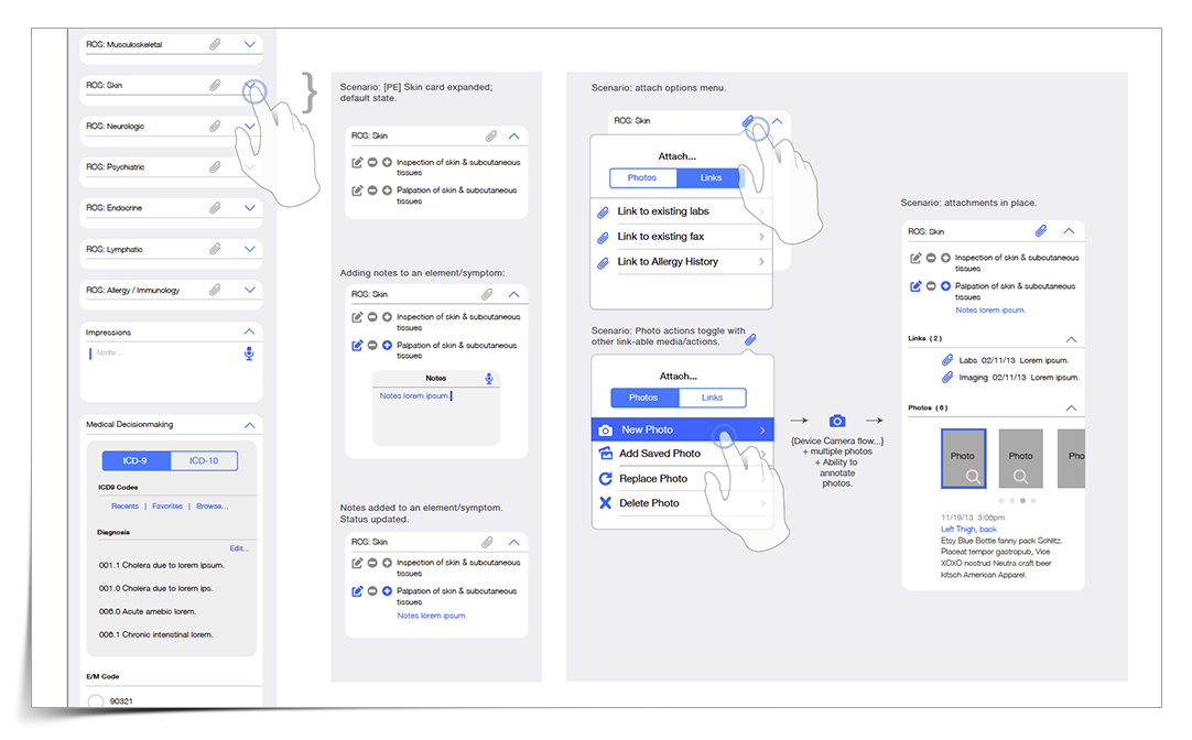
Scenario: Care team working through a Note. Each of the two main panels scrolls vertically/independently, providing efficient and contextual interaction between local navigation on left and associated card content on right.
This was my suggested solution to the common use case of physicians needing easy and intuitive access to all parts of a 'Note' during a patient exam. [Common complaints of current EMR's: they force the user to focus more on the tool rather than the patient.] The card interaction methodology heretofore unseen in EMR's, and was met with great enthusiasm by our SME's.