UX & Information Architecture
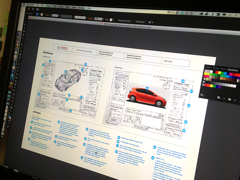
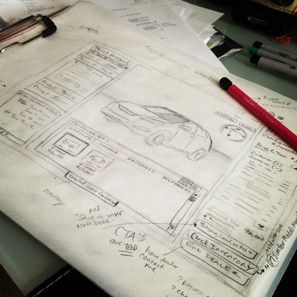
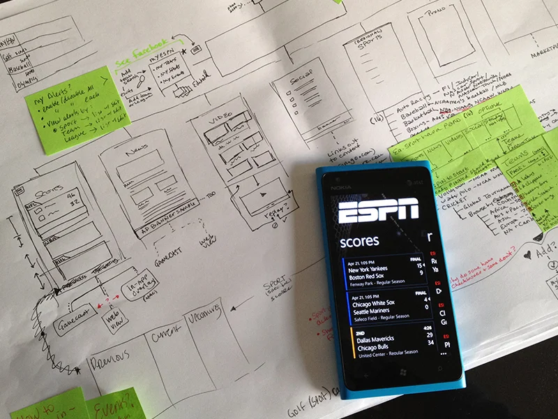
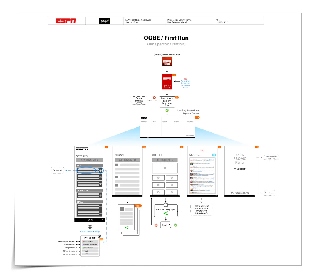
I was asked by Pop Interactive in Seattle to provide the UX for this very exciting opportunity.
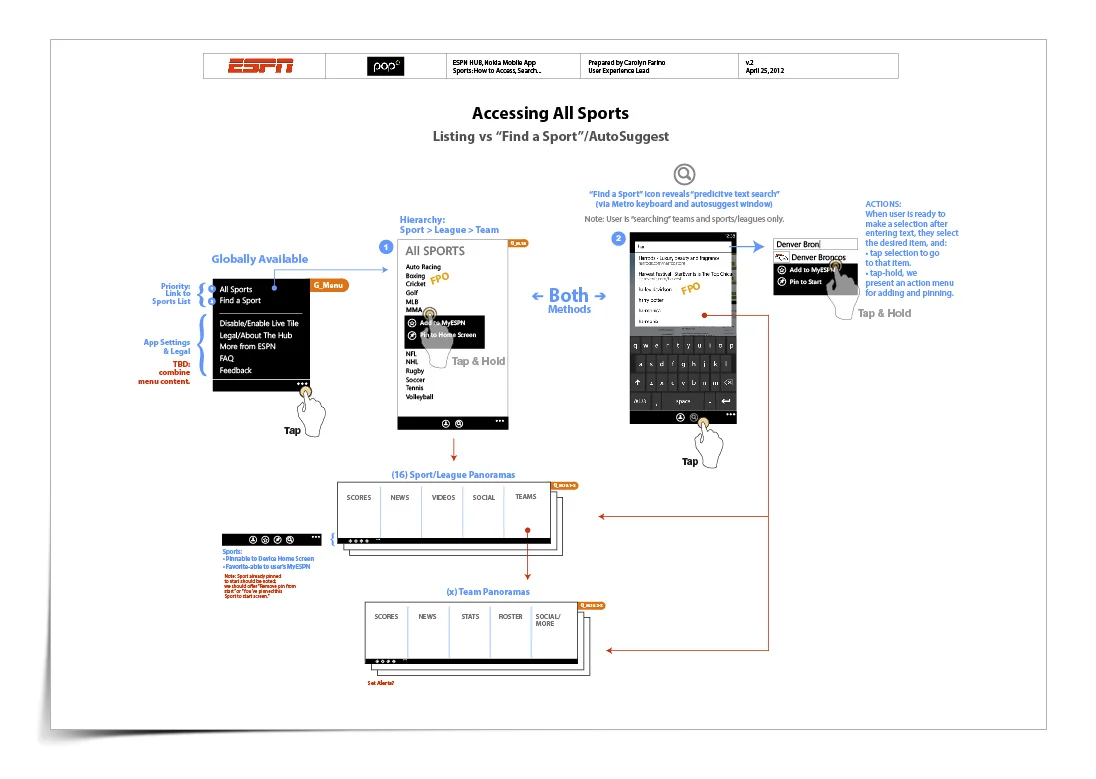
The Ask: to translate ESPN's product vision, feature set and regionalized business rules into an outstanding user experience and design that serves ESPN fans around the world, takes advantage of Windows Phone's differentiating capabilities and provides a scalable foundation for ESPN's aggressive feature roadmap.
Background: The ESPN Hub App is exclusive to NOKIA phones using the WP7 platform. The ESPN partnership with Nokia is designed to: introduce the ESPN into more global markets and help Nokia establish itself in the US smartphone market.
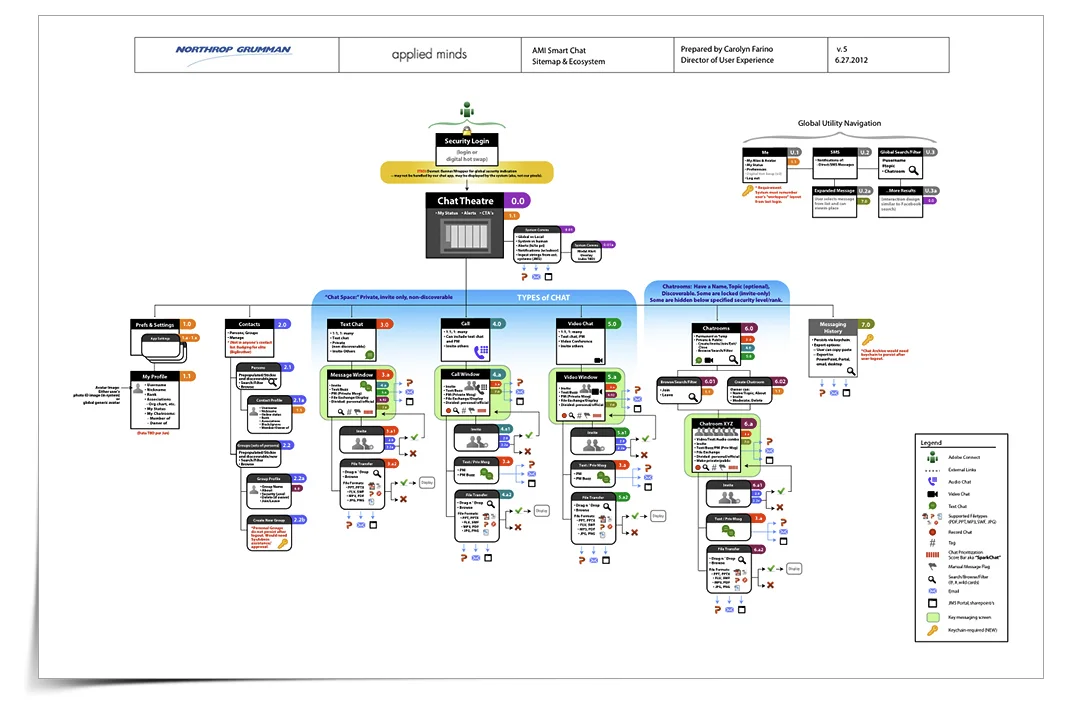
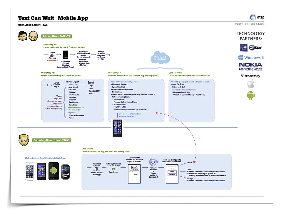
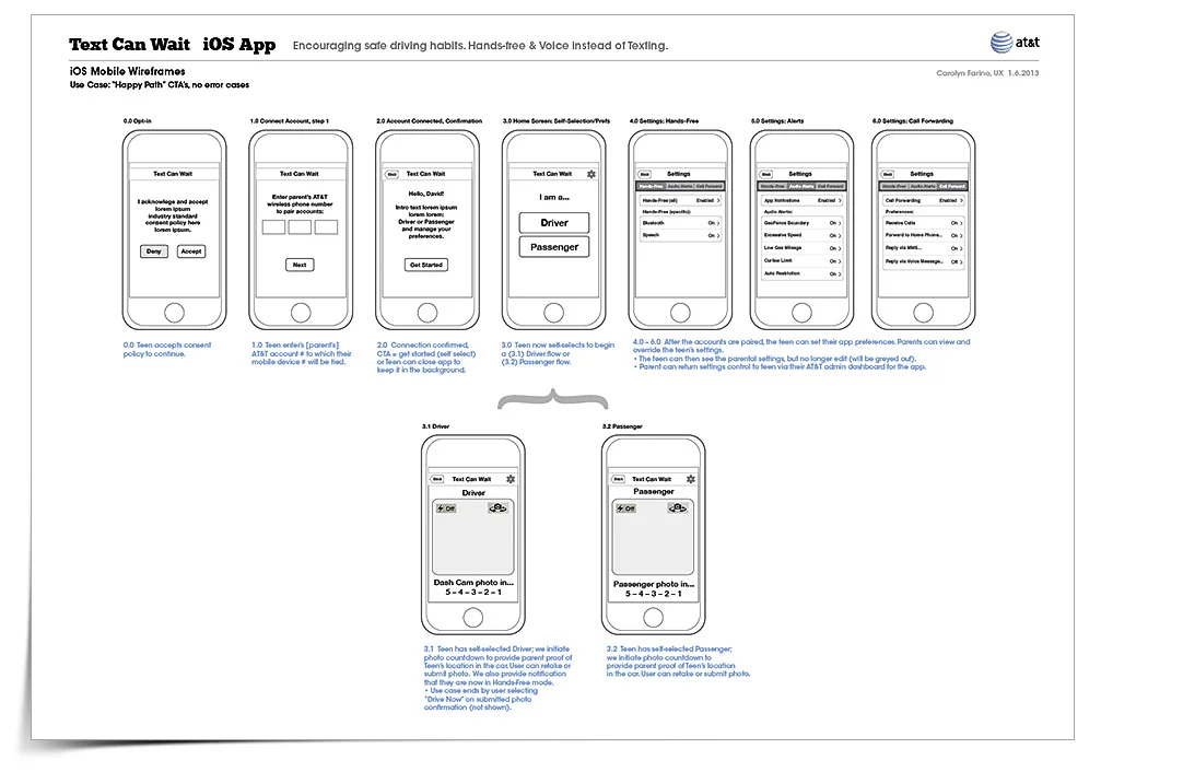
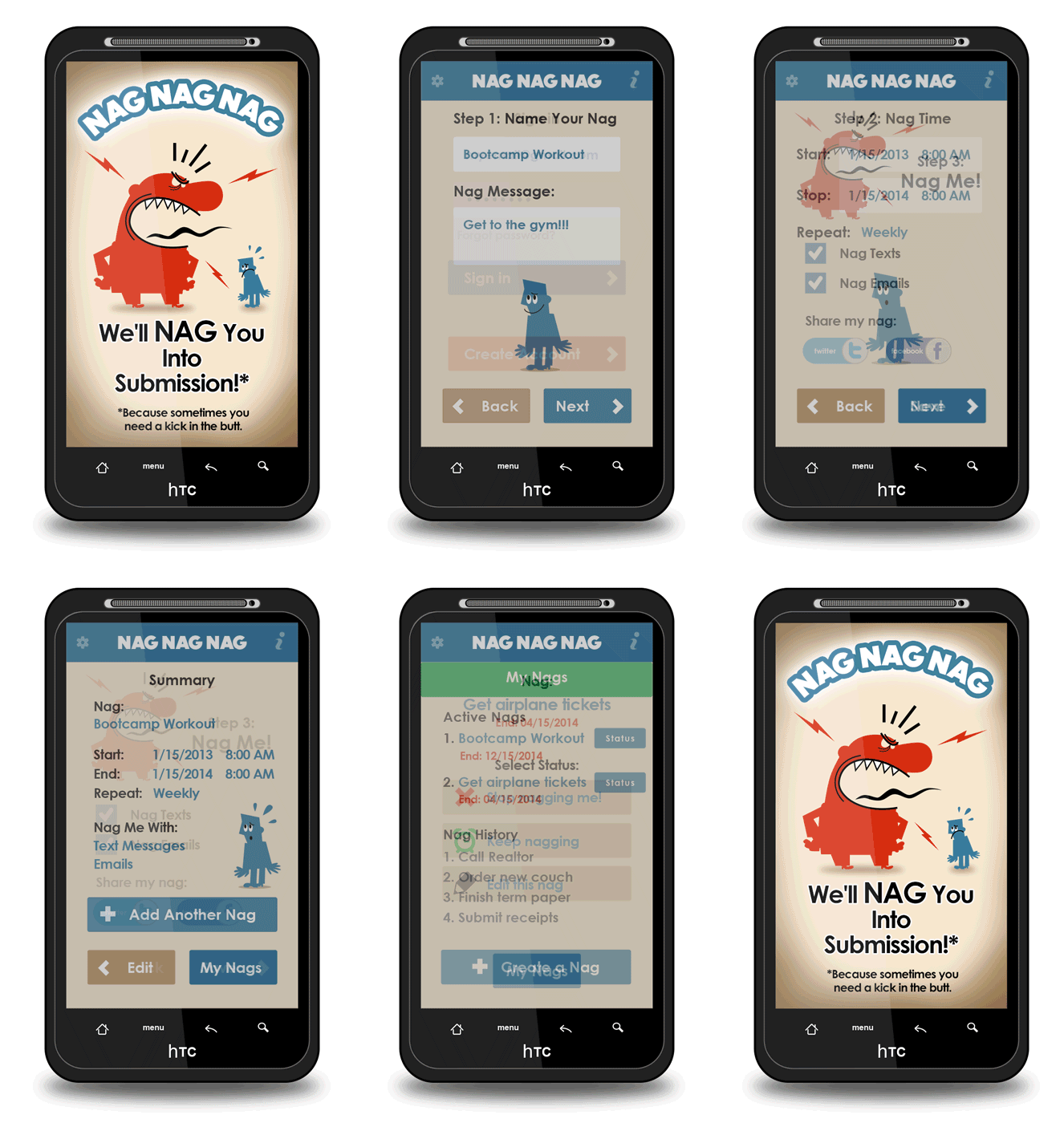
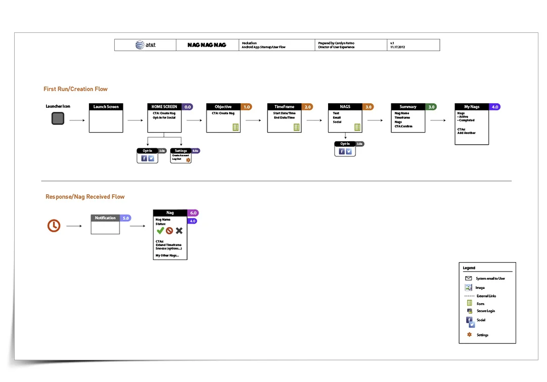
My first hackathon, entered for fun and the experience of it. Was a great time and and I loved the competition aspect.
24 hours to conceive the idea, socialize and collaborate with team members, develop the user experience around achievable features and functionality all while keeping in mind the timeframe and technical requirements (and team members coding capabilities).
BE's "Beauty Mark" campaign involved casting six models, creating a print ad for each of them, featuring a QR code (the "Beauty Mark"). The CTA was that the user scan the code and see a model's special mobile website. At this site, the user can view the model's video, the Bare Escentual products she is wearing and locate a BE retailer near them.
The sitemap for the Beauty Mark mobile experience, indicating where the user enters via the QR code, landing page, experience options and CTA's.
Wireframes for the Beauty Mark mobile experience. Landing screen presents users with options to view the models video, explore the other models' profiles, learn more about her BE products, and geolocation for a BE retailer.
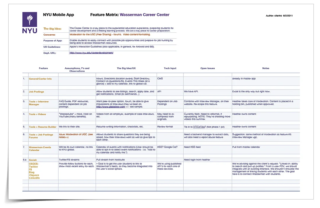
This is what I refer to as a "Feature Matrix," of which four were created for this project: Health Services, Student Life, Transportation and the Wasserman Career Center.
Feature Matrices are a useful tool in the definition phase of a project. It allows the team to identify, scope and prioritize features, while also indicating all aspects of each feature including open issues, ownership, dependencies, content/tech details, etc. Feature Matrices inform the next step: sitemaps.
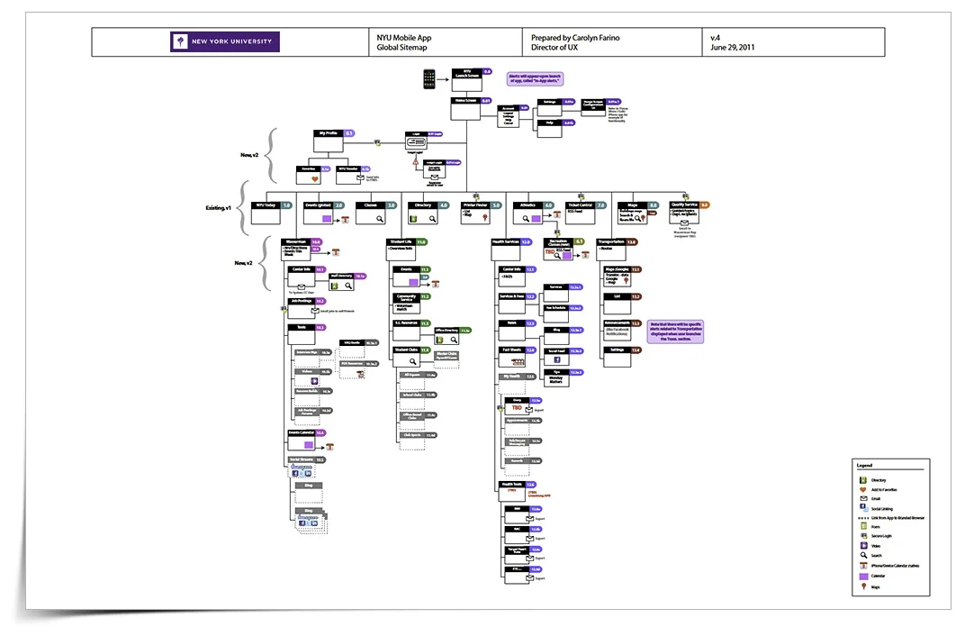
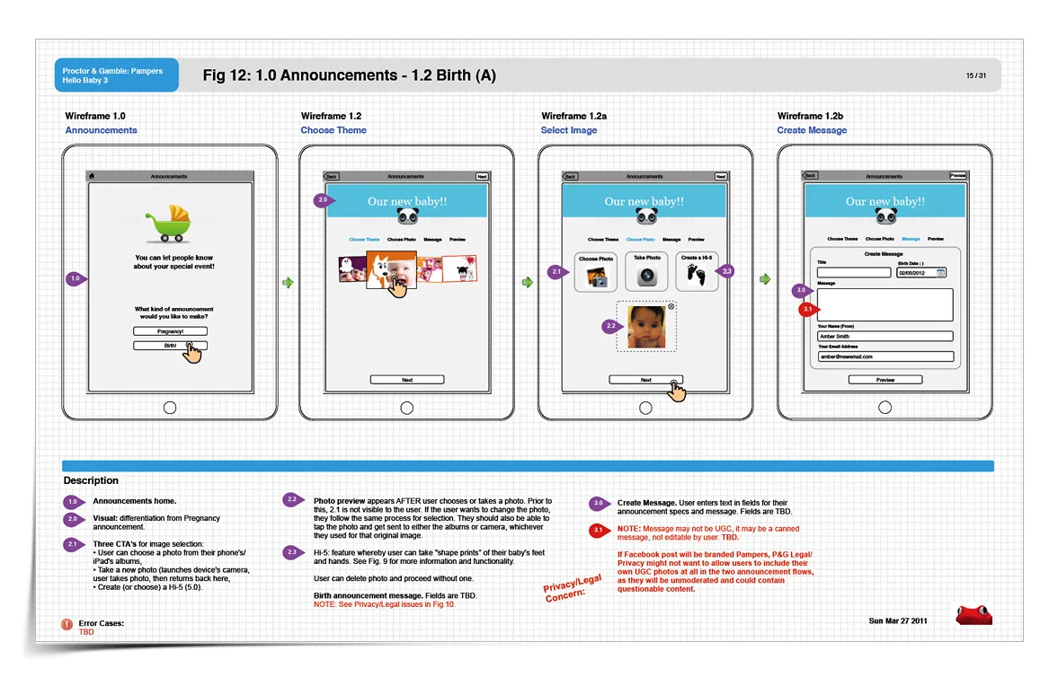
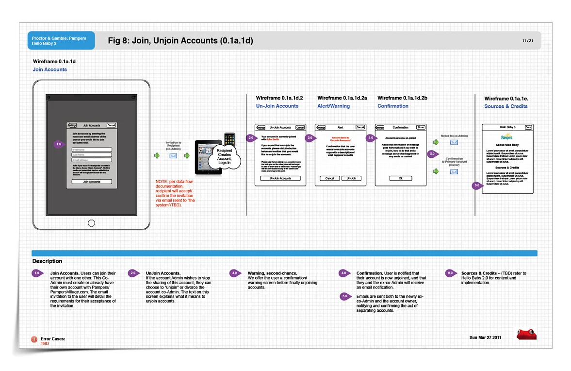
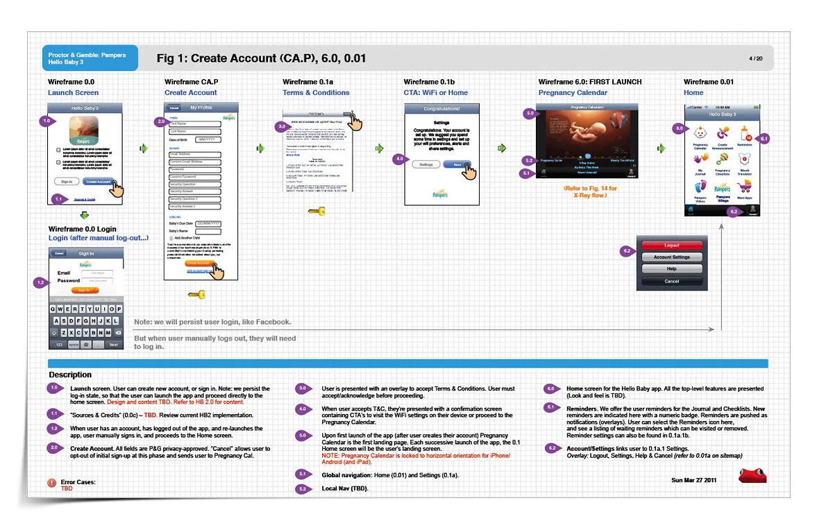
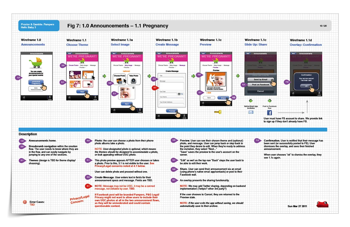
The app is very compact and has many features: student profile account management and security, links to NYU departments and many top level features each with their own relatively deep sub-features. Users can access PDFs, create/manage favorites, forward notable content to self/peers, add items to their calendar, access directories, participate in social networking, search job postings, explore campus and athletic events, receive alerts regarding transportation, and much more.
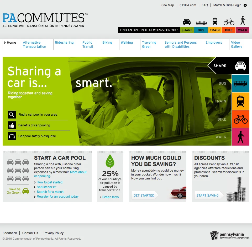
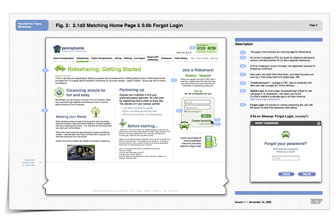
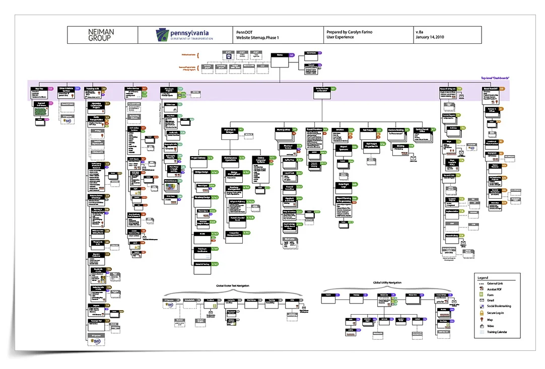
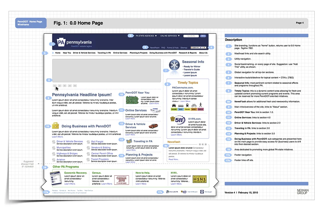
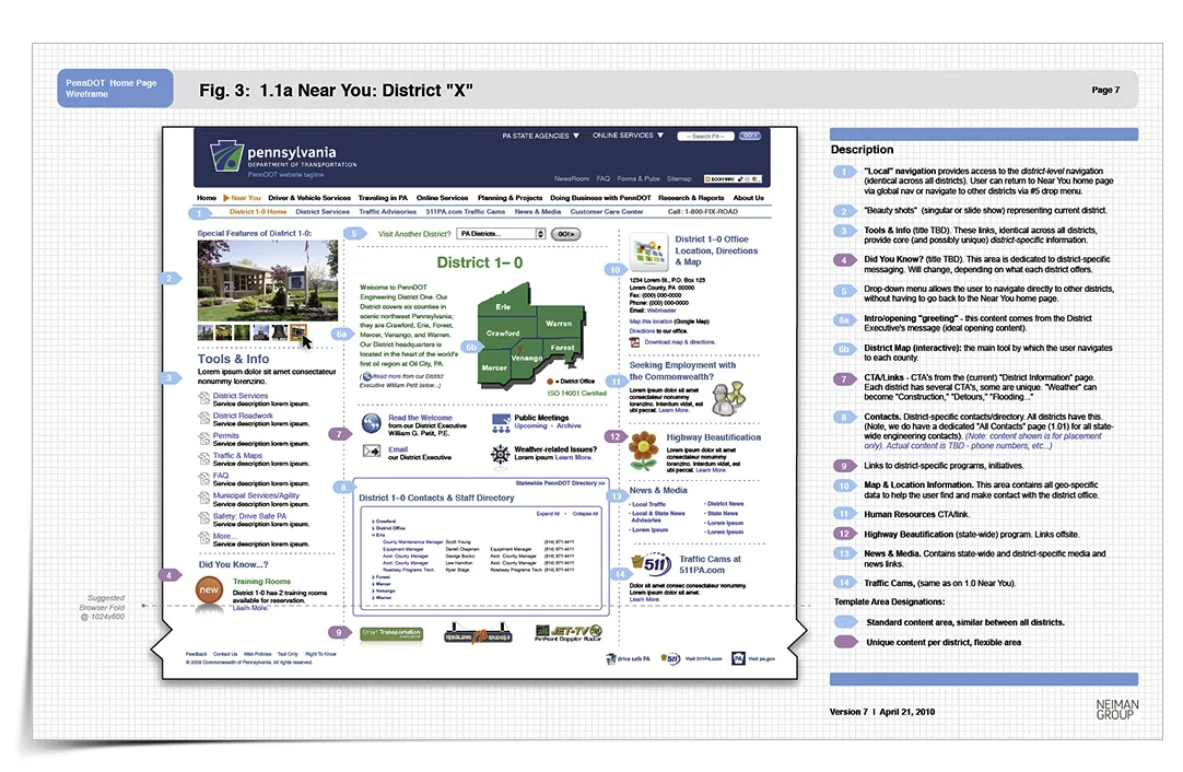
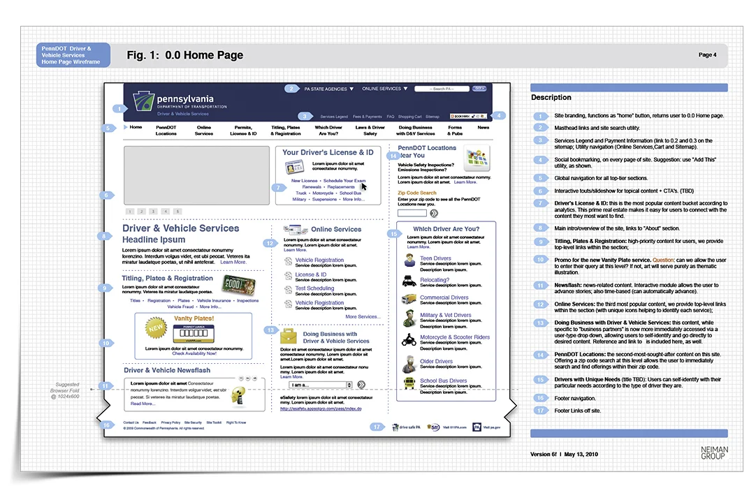
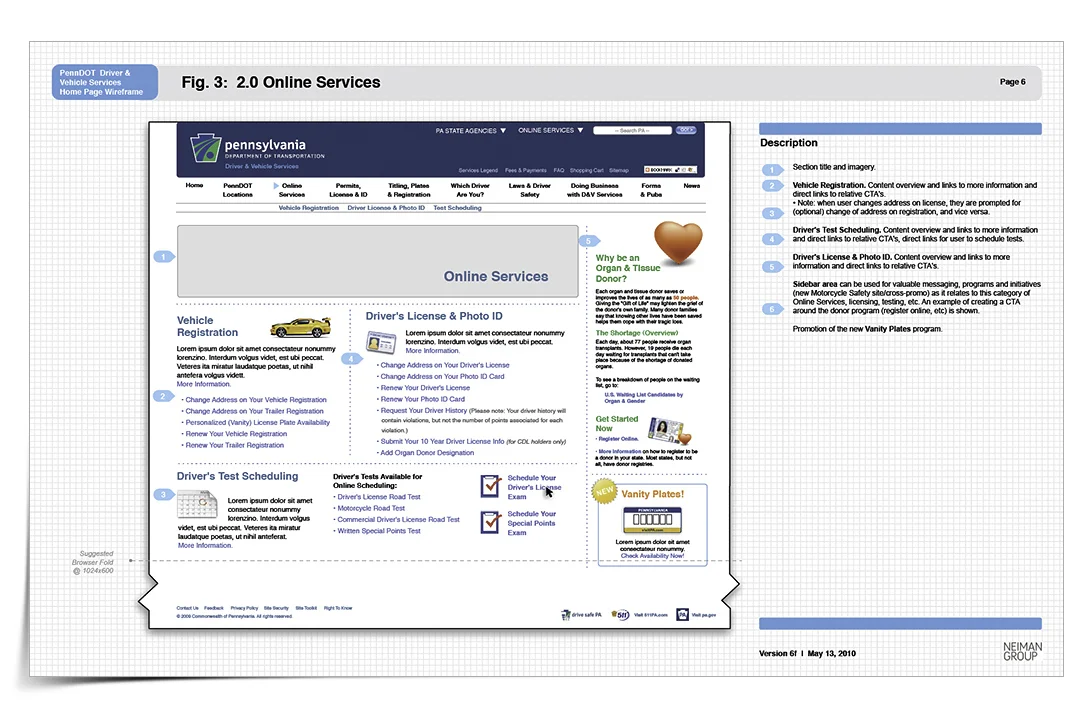
[Artwork by Neiman Group] As the third of three projects for Penn DOT and Neiman Group, I was asked to create the architecture for the new web experience for PA Commutes Alternative Transportation Campaign. One of the main issues with low ridership in PA was basic unawareness and misconceptions around PA's alternative transportation options. Neiman Group tapped me for the UX as they created this very handsomely-designed and smart solution.
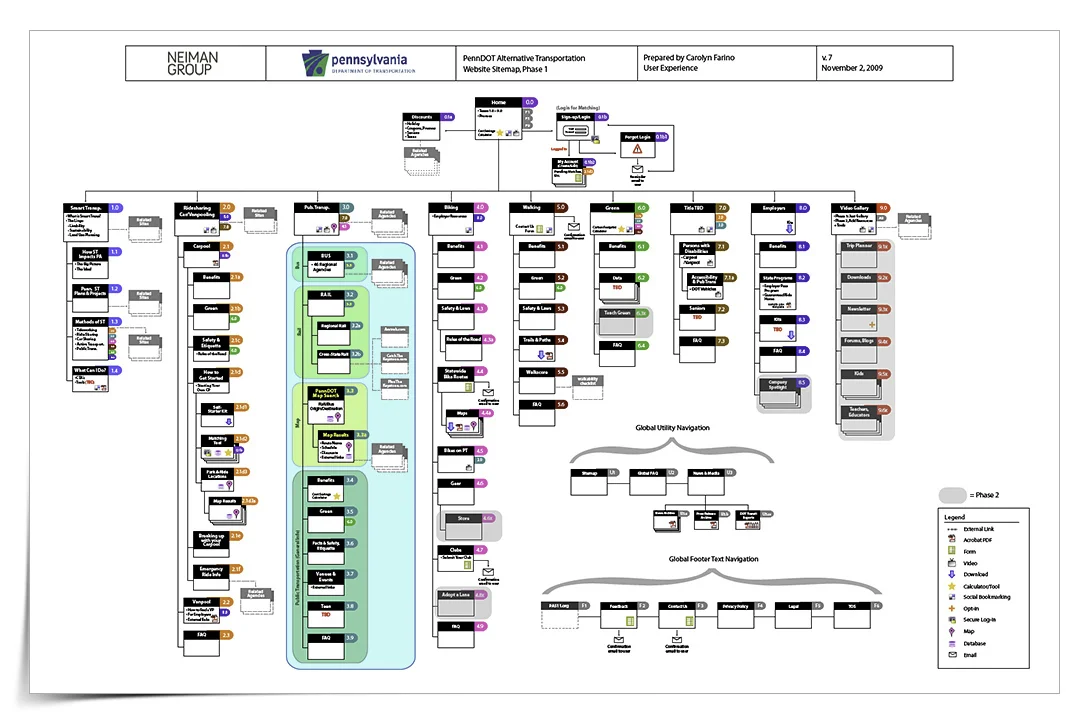
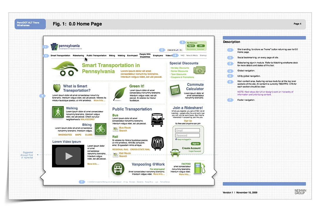
I created the wireframes based on the architecture outlined in the sitemap. The wireframes indicate navigation and content hierarchy, high-level interaction design and note tech implementation points when pertinent. This particular client appreciated a more 'high-fidelity' and visually detailed approach to the UX architecture.
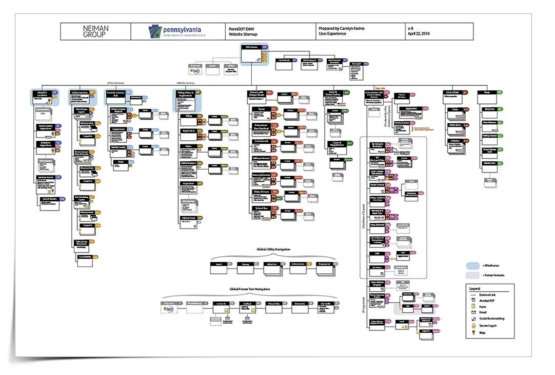
My second of three projects for the Penn DOT. I welcome these complex projects as I really love engaging with and untangling complex content and repairing convoluted usability, both of which were present in Penn DOT's DMV website as it evolved over many years. This sitemap reflects my new architecture.
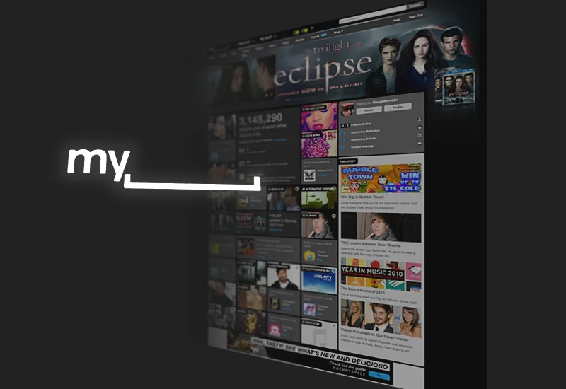
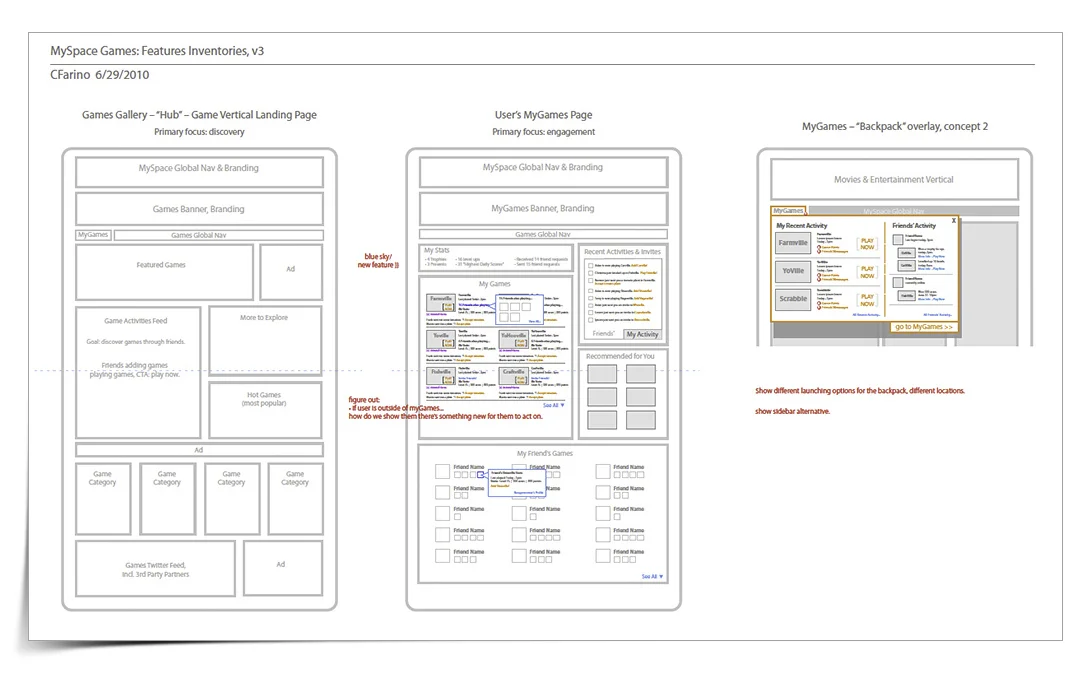
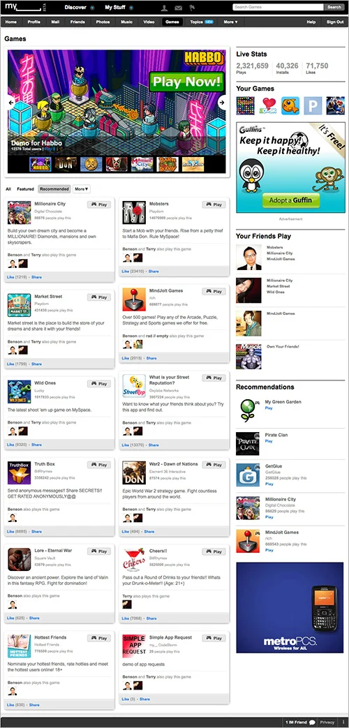
For the 2010 re-launch of My Space (prior to its sale), I was asked to participate in the redesign by creating the architecture for the Games vertical for this famous social network's upcoming re-launch.
The other verticals were 80% complete in their redesigns at the point I joined the company. It was almost a forgotten component, missing user personas and any significant development of note. I began bringing this vertical up to speed by establishing the core user personas (primary and secondary), creating a sitemap of the games ecosystem and establishing a "page grid" of feature/functionality hierarchy. I worked closely with the core design team who were responsible for creating GUI standards and delivering the daily roll-out of new specs to the hundred-or-so creative staff involved in this all-hands-on-deck massive (and well choreographed) effort.

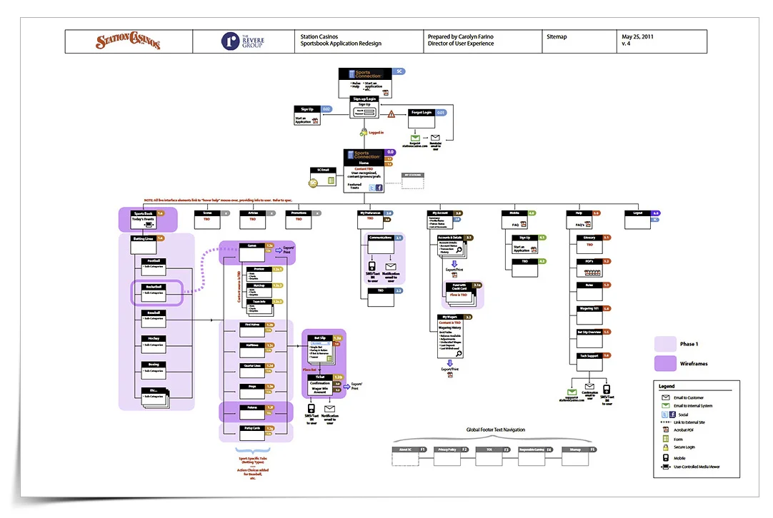
Station Casinos' online sports book was over ten years old – it looked out of date, it's usability was challenged, the other Stations' properties had matured leaving this group out of sync, there was a mobile app already in development leading the way (and again, leaving its parent site behind). I was invited to recreate the user experience and architecture. Luckily it was not an issue that I was not a gambler, nor had I ever participated in sports book gambling – these types of things
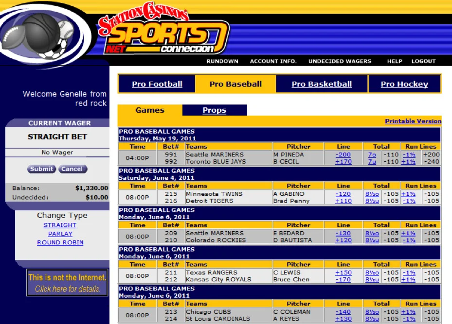
This is the original sports book interface, with many usability issues, not the least of which (through my interviews with staff and manager of the Red Rock Casino property Sports Book) was that once a user placed a wager, they were unaware of how much they stood to gain or lose. Compounding the issues were confusions about wagering types, account management, multiple bets, yearly accounting, etc. I completed a full heuristic on the existing experience, conducted stakeholder interviews, competitive analysis, and worked with the team on new features. I created a Feature Matrix (not shown) to scope and manage this phase one effort. I also provided a sitemap and detailed wireframe deck reflecting my proposed solutions.
Note: I was given ten days to complete the entire UX effort.
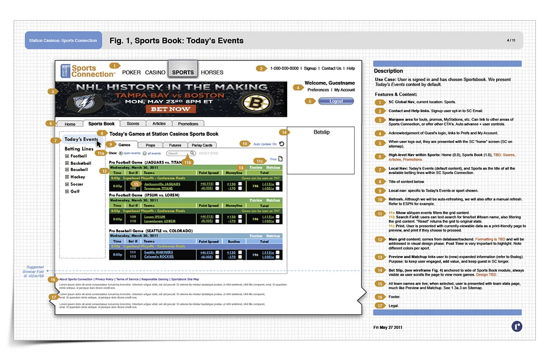
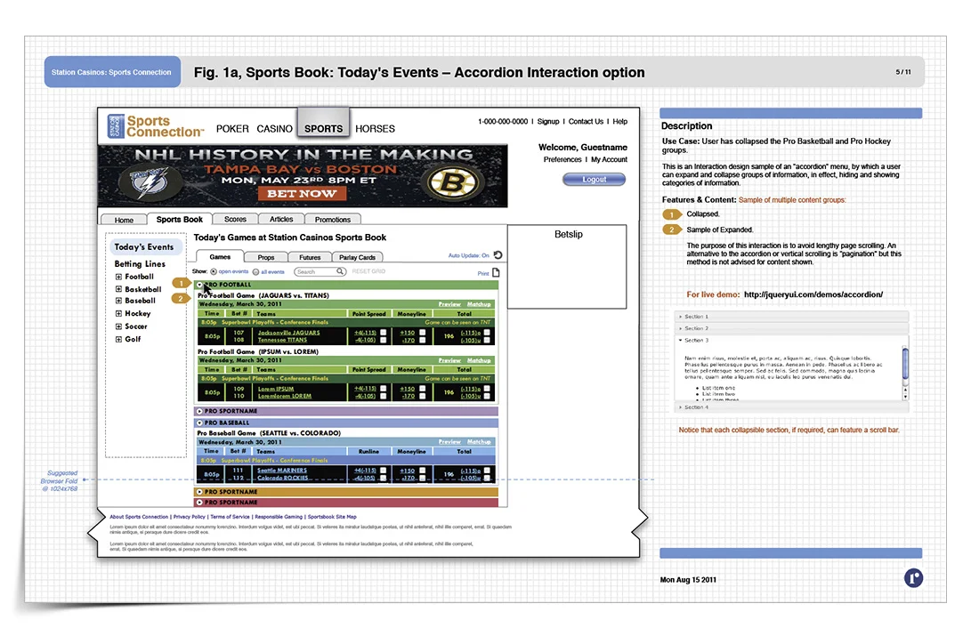
Once user has signed in, they are presented with Today's Events, color coded by sport. Navigation is articulated by a new visual hierarchy for global nav, topical nav and sub nav systems. New advertising space is presented to offer cross-marketing options. The new bet slip is anchored in place and allows easy access, should the page feature lengthy content necessitating vertical scrolling.
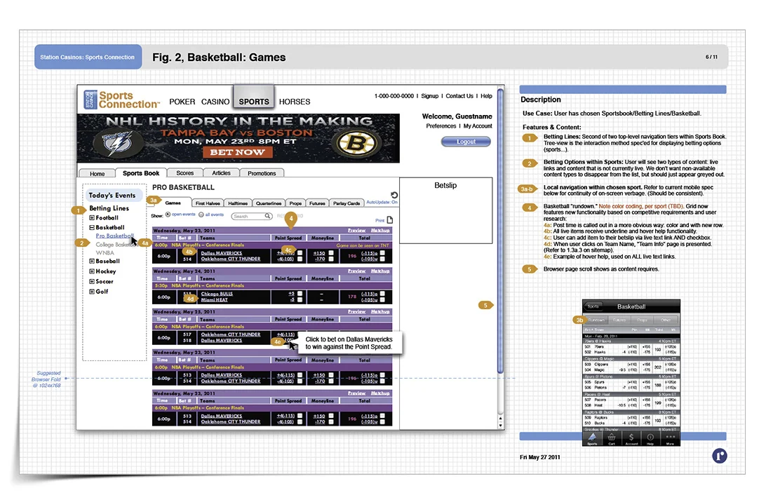
Novice users were having a difficult time learning and advancing their skill with the very complex sports book interface. By offering this tool tip feature, novice users can receive contextual help and pointers as they develop knowledge and comfort with online wagering. More seasoned users have the option of disabling this feature in the preferences area.
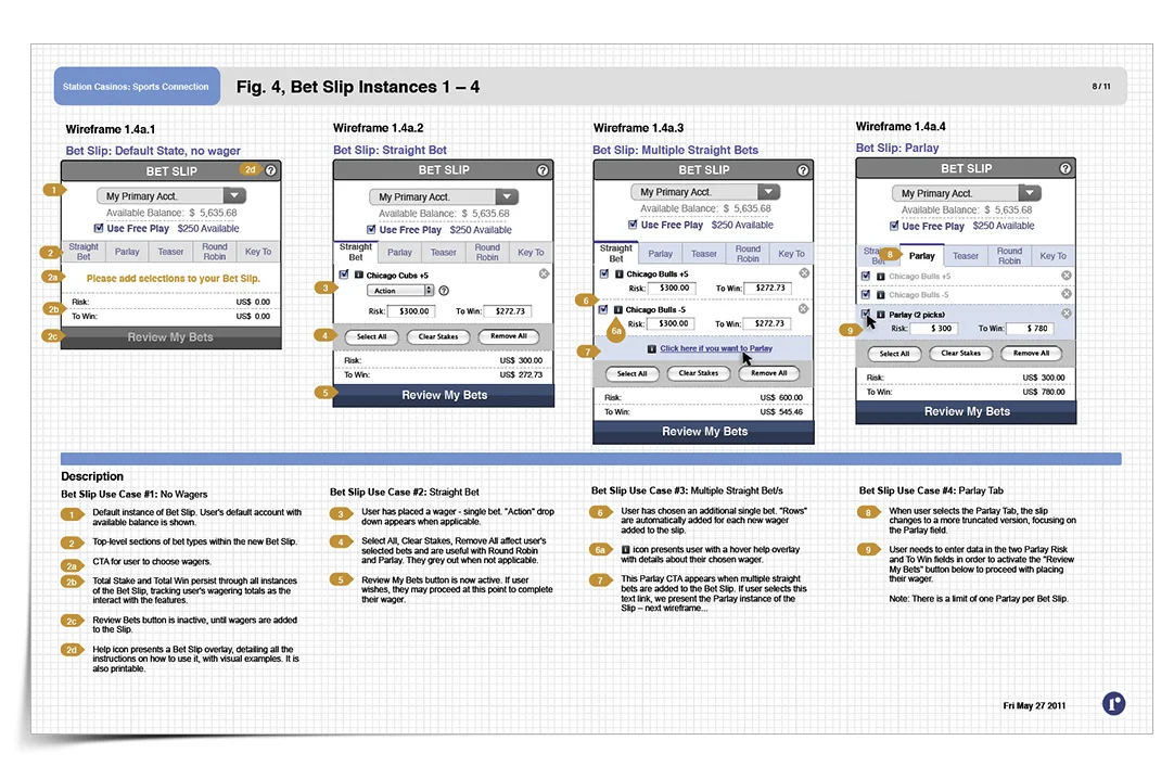
There is much functionality packed into this little now-ever-present feature, the backbone of the user's entire sports book experience. The bet slip captures all wagering scenarios and user-decisions while also offering customization of wagers, combinations, wager amounts, associated user accounts, etc.